fr3sh Posted April 20, 2009 Report Share Posted April 20, 2009 Razorsharp I'm liking the effects, first one looks kinda futuristicky.. if that's a word Quote Link to post Share on other sites
QDRenegade Posted April 22, 2009 Report Share Posted April 22, 2009 (edited) Black Glock on black background made for an inviting 9mm bullet shot. Wish this wouldn't bump the thread though since I already put this in the Glock topic. ETA: Edited April 22, 2009 by QDRenegade Quote Link to post Share on other sites
Firefly0 Posted April 22, 2009 Report Share Posted April 22, 2009 I think this pic belongs to here: Quote Link to post Share on other sites
QDRenegade Posted April 22, 2009 Report Share Posted April 22, 2009 Got another dark one. Hopefully not too dark. So ends my day of photography - two decent photos and one that is... well... yeah. Quote Link to post Share on other sites
Horsem4n Posted April 23, 2009 Report Share Posted April 23, 2009 (edited) im still looking through my photography portfolio trying to find a good pic to use this filter on and this one turned out pretty good. still trying to find the stunning one though. what process did you use on your glock and USP pics above Renegade? EDIT: Bah! forgot to border it... Edited April 23, 2009 by Horsem4n Quote Link to post Share on other sites
QDRenegade Posted April 23, 2009 Report Share Posted April 23, 2009 what process did you use on your glock and USP pics above Renegade? EDIT: Bah! forgot to border it... Both the same Glock But the process between the two was pretty different. The first one started as a good photo, the second (red one) started as a crappy attempt at showcasing my AEG which ended up getting all but cropped out. I wish I hadn't deleted the originals (were on thumb drives) such that I could show you what they started as, but I can tell ya that they were not quick edits. When I get creative, I can edit ###### into something rather cool - sometimes. Here is an example of an edit I made for someone else showing what I would have done (per request): Original: Final: Basically, I just rip the image apart and work the foreground separate from the background. That said, among things I desaturated the blues out of the photo to put emphasis on the bronze and gold of the bullet and then made the tritium glow a bit more than it did originally. After playing with the contrast, the Glock, in addition to properties of the photo, began to look like a tarnished moment in time so I went with it. In the end, though, the bullet is the real object of attention and can almost stand alone: I really hit some weird tangents here which Ill have to clarify sometime later, but I can sum it all up by saying that I just simply played with the photo for about 20 minutes. I can leave a few important things though: -Pick the subject and the background. Determine whether color or contrast should differentiate the two. -If using Photoshop or GIMP, always duplicate your layers, do the work, then blend the two so as not to make any changes blatantly obvious. -Fake DOF always looks pretty bad and requires nasty compositing (see above) which renders weak results. Rely on the camera for Bokeh. -Keep the final resolution small such that the result is contained and tidy. You mentioned a border which is always a good final step. -Black and white almost always stinks for largely monochrome objects - always keep a little color (note the blues, yellows, and reds in the three images I posted today). That said, Id be happy to answer and specific questions or post a step by step editing of a photo if you have a good starter. I know they don't end up looking very realistic, but I try to make em stand out a bit. Dont mean to sound like an *albatross* (dont think I did) but Im just babbling (typing) at this point so I think Ill stop here. Its been a long day. Cheers. Hopefully this post wasnt entirely useless. Quote Link to post Share on other sites
Horsem4n Posted April 23, 2009 Report Share Posted April 23, 2009 (edited) you dont sound like an *albatross*, but i do already know those things (im not new to photoshop). i was just looking for how you brought out a tarnished look without making it look over contrasted. after hearing somewhat of what you did, im sure i can replicate something similar, given the chance. thanks. i would display some of the pics i did that i admire, but none of them are airsoft orientated. i just really like how, if your not looking directly at the pic, the bullet seems like is doesn't belong in the picture, yet when you actually look at it, it just works. Edited April 23, 2009 by Horsem4n Quote Link to post Share on other sites
Ethereal Posted April 23, 2009 Report Share Posted April 23, 2009 Absolutely beautiful work on that Glock, Renegade. Here's a digital piece I worked on for a month or more. The gun and hand are entirely vector art (created with a photograph of my Classic Army SCAR as a reference), and the background is an altered photograph. It'll eventually be printed on a 40" by 36" canvas. The image is actually a ridiculously high resolution, so there's a lot more detail than can be seen here. Quote Link to post Share on other sites
Horsem4n Posted April 23, 2009 Report Share Posted April 23, 2009 that's sick! so, did you make the vector art yourself or did you play around with it after live tracing it? i have also bee trying to make such a smooth live tracing for a while, but i don't have high enough res pics to work with. i only have a 5MP camera at this time. hopefully i can do something better with the 8MP camera i'm getting at the end of the may. i have been wanting to do a web comic using live traced photography (in that level of smoothness). any insight into my wonder? Quote Link to post Share on other sites
Ethereal Posted April 23, 2009 Report Share Posted April 23, 2009 Thanks. No, it was vectored by hand in Adobe Illustrator. I don't know anything about live tracing, so I'm afraid I can't help you there. Quote Link to post Share on other sites
Horsem4n Posted April 23, 2009 Report Share Posted April 23, 2009 (edited) first, that is an awesome job for a custom vector. now... ha, how long have you had illustrator and you havent used live trace? if you have an imported image selected, go to "object" and look toward the bottom at live trace. select "tracing options" and play around with it while "preview" is selected. with an image selected, the live trace option is also available in the top toolbar. basically, it detects color areas and transforms them into vector shapes. the sharper the image, the smoother everything can look. have fun with it, its my most favorite tool in the program. now, my next question is: did you use the pen tool on top of the picture, in a tracing style, or did you make the shapes yourself with the pic off to the side? either way, its still an awesome job without the help of the live trace tool. Edited April 23, 2009 by Horsem4n Quote Link to post Share on other sites
Crow Posted April 24, 2009 Report Share Posted April 24, 2009 These are my first photos. I thought I'd take my 1911 and give it a try. This is what I got. Quote Link to post Share on other sites
Renagade Posted April 29, 2009 Report Share Posted April 29, 2009 Could be considered art, I guess. Quote Link to post Share on other sites
Ethereal Posted April 30, 2009 Report Share Posted April 30, 2009 first, that is an awesome job for a custom vector. now... ha, how long have you had illustrator and you havent used live trace? if you have an imported image selected, go to "object" and look toward the bottom at live trace. select "tracing options" and play around with it while "preview" is selected. with an image selected, the live trace option is also available in the top toolbar. basically, it detects color areas and transforms them into vector shapes. the sharper the image, the smoother everything can look. have fun with it, its my most favorite tool in the program. now, my next question is: did you use the pen tool on top of the picture, in a tracing style, or did you make the shapes yourself with the pic off to the side? either way, its still an awesome job without the help of the live trace tool. I had the image under my work and traced directly off of it. I'll try Live Trace when I get the chance, but I'm slightly afraid of what I'll find. It's kind of disheartening to spend 30 hours on a project and have someone walk up and say "is that just a PhotoShop filter?" (that particular phrase was actually used in reference to a PhotoShop painting, rather than a vector). But if they can develop a tool that makes vector art that looks as good as the hand-drawn stuff, then I say - through gritted teeth - "why not use it?" Renagade, I like that second picture. The yellowcast makes the texture (oxidation?) on the ironsight look very interesting. Is that colour intentional, or did you forget to white balance? Quote Link to post Share on other sites
Renagade Posted April 30, 2009 Report Share Posted April 30, 2009 I have to mess with the settings with the camera, due to poor lighting in my apartment. I don't like using flash, so everything comes out like the above, but I'm okay with it in the end. Quote Link to post Share on other sites
Horsem4n Posted May 1, 2009 Report Share Posted May 1, 2009 (edited) its good not to use flash. but you did use the wrong white balance settings. whatever the dominant light source is; be it incandescent, florescent or the sun, there is a respective white balance setting. in your case, it seems like there was a dominance of sunlight and you had the camera set to either florescent or incandescent. but if you had a photography camera (like an SLR) you would set white balance by numbers. BUT, it is a good artistic decision to sometimes use the wrong white balance effect to make it look good. in your case you were lucky. Edited May 1, 2009 by Horsem4n Quote Link to post Share on other sites
beretta Posted May 1, 2009 Report Share Posted May 1, 2009 WoW!, this thread is brilliant. Just checked my pics collection and these would be some of my personal favs. HFC USP, Army Armaments MEU, And a custom M16 VN with G&P receiver. Quote Link to post Share on other sites
RacingManiac Posted May 1, 2009 Report Share Posted May 1, 2009 its good not to use flash. but you did use the wrong white balance settings. whatever the dominant light source is; be it incandescent, florescent or the sun, there is a respective white balance setting. in your case, it seems like there was a dominance of sunlight and you had the camera set to either florescent or incandescent. but if you had a photography camera (like an SLR) you would set white balance by numbers. BUT, it is a good artistic decision to sometimes use the wrong white balance effect to make it look good. in your case you were lucky. One could use flash if it is possible to bounce it. Direct usually looks pretty nasty. With the system I use wireless bounce is pretty easy to do with my DSLR, so I usually use flash. Though I also recommand using tripod and just run longer exposure if necessary.... If you can shoot RAW you can correct the white balance later too... Quote Link to post Share on other sites
Robinio Posted May 3, 2009 Report Share Posted May 3, 2009 Maybe not really airsoft, but the gun I'm drawing/holding is my WE1911 (can be found in 1911 thread) A fake movie poster for a school project. Quote Link to post Share on other sites
Horsem4n Posted May 4, 2009 Report Share Posted May 4, 2009 its not very great. but thats because i want to make it better... can i get the original pic? Quote Link to post Share on other sites
Robinio Posted May 4, 2009 Report Share Posted May 4, 2009 You talking to me? :S Quote Link to post Share on other sites
Spartan117x Posted May 4, 2009 Report Share Posted May 4, 2009 (edited) Because all I know is how to take pics of zoomed [and angled] in photos with a not great camera Edited May 4, 2009 by Spartan117x Quote Link to post Share on other sites
beretta Posted May 4, 2009 Report Share Posted May 4, 2009 Heres a couple more of my favourates, I like the way the gun stands out on the black, i should shoot on black more often. Quote Link to post Share on other sites
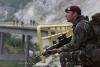
Ghost Sandman Posted May 7, 2009 Report Share Posted May 7, 2009 (edited) Very nice work guys I have a pic if anyone wants to play with it. http://i229.photobucket.com/albums/ee167/D...19be61ff5db.jpg Thought it was cool pic taken of me, the pic was taken by the photographer of war machine airsoft. Edited May 7, 2009 by Ghost Sandman Quote Link to post Share on other sites
Horsem4n Posted May 7, 2009 Report Share Posted May 7, 2009 (edited) ghost, its too small. You talking to me? :S yes. Edited May 7, 2009 by Horsem4n Quote Link to post Share on other sites
Recommended Posts
Join the conversation
You can post now and register later. If you have an account, sign in now to post with your account.